The PlotDevice Grid library offers a number of tools to work with rows and columns in a page layout. It’s like having a combination of InDesign and Excel available in PlotDevice. You can use the library to generate flowing columns of text and image grids, automatically apply aesthetic proportions between cells in the grid, create spreadsheet tables with (simple) statistics, define reusable visual styles in a CSS-like way. Numerous of text commands help you for example determine good, legible column widths, apply widow/orphan control to paragraphs, generate lorem ipsum placeholder text.
Central concepts in this library are:
- Grid: rows and columns containing cells. Each cell can be a new grid.
- Content: a text or a list of images that is divided among the rows and columns in a grid.
- Proportion: aesthetic relations between the cells in a grid.
- Style: a description of colors, typography, whitespace that can be attached to cells.
The library has a caching mechanism that allows you to create multi-page documents (e.g. a book), keeping track of the text and images that have already been drawn along the way.
Download
| grid.zip (60KB) Last updated for NodeBox 1.9.4.2 Licensed under GPL Author: Tom De Smedt |
Documentation
- How to get the library up and running
- Creating a grid
- Splitting and navigating the grid
- Adding content
- Working with text
- Working with styles
- Working with proportions
- Resizing cells
- Spreadsheet statistics
- Multiple pages
How to get the library up and running
Put the grid library folder in the same folder as your script so PlotDevice can find the library. You can also put it in ~/Library/Application Support/PlotDevice/.
grid = ximport("grid")
Creating a grid
create(rows=1, columns=1, width=None, height=None)
The create() command returns a new grid object, by default encompassing the entire drawing canvas. You can define the number of rows and columns in the grid and a different width and/or height. A grid also has lots of properties and methods to make life easier. We’ll briefly summarize them here and discuss them in detail later on.
The returned grid object has the following properties:
Navigation
- grid.name: the name of the grid.
- grid.parent: the grid in which this grid is a cell, None for the top-level grid.
- grid.root: the top-level grid, e.g. the container for all other grid cells.
- grid.rows: a list of rows in the grid. Each row is a list of contained grid cells.
- grid.columns: a list of columns in the grid. Each column is a list of contained grid cells.
- grid.top: the row or cell at the top in the grid.
- grid.bottom: the row or cell at the bottom in the grid.
- grid.left: the column or cell at the utmost left in the grid.
- grid.right: the column or cell at the utmost right in grid.
Position and size
- grid.x: the horizontal offset of a cell.
- grid.y: the vertical offset of a cell.
- grid.width: a cell’s width in pixels.
- grid.height: a cell’s height in pixels.
- grid.relative_width: a cell’s width as a number between 0.0 and 1.0, relative to other cells.
- grid.relative_height: a cell’s height as a number between 0.0 and 1.0, in relative to other cells.
- grid.fixed: True when this cell does not harmoniously rescale to make room
for other cells.
Content
- grid.content: the content for the grid, divided among the rows and columns.
- grid.content_width: the actual width available for content, minus whitespace.
- grid.content_height: the actual height available for content, minus whitespace.
- grid.flow: a list of cells in the grid, defining the flow of content.
Style and proportion
- grid.style: the name of the current visual style.
- grid.styles: a dictionary of available styles.
- grid.proportion: a collection of properties defining how cells are spaced in relation to each other.
Each row and column in the grid has the same properties available, with the exception of rows, columns, proportion and flow. This enables you to set the size, style or content for all the cells in a row or column in one go.
The grid.draw() method draws the grid to the canvas, calculating text flow and
applying styles.
The grid.copy() method returns a new grid object that is an exact copy of this one.
grid.draw(x=0, y=0)
grid.copy(parent=None)
You can loop through the grid like a list of cells:
for cell in grid:
    print cell.name
Splitting and navigating the grid
The grid object has a grid.split() method that divides the grid into rows and columns of cells. It can be supplied an optional proportion and style name. The grid.clear() method removes all cells (but it retains the grid’s style, proportion and content).
grid.split(rows, columns, proportion=None, style=None)
grid.clear()
To fully grasp the way a grid works you need to understand its recursive nature. A grid is made up of cells, arranged into rows and columns. Each cell is a new grid object. Take a look at the example below. We split a grid into two rows and two columns. Since the top-level cell is a grid object as well, we can use its split() method to subdivide the layout further.
|
|
g = grid.create(2, 2, 150, 150) g.cell(0,0).split(2, 2) g.styles.margin = 1 g.styles.background = ( color(0.5, 0.55, 0.6), color(0.4, 0.45, 0.5) ) g.draw() |
Navigation
A grid has the following methods to retrieve a row, column or single cell:
grid.row(i)
grid.column(j)
grid.cell(i,j)
grid(i,j)
Just as with lists the supplied indices start from zero (so the first row has index 0 and not 1). You can also use the rows and columns properties, which are both lists.
The top, left, bottom and right properties are also very useful
to retrieve rows and columns at the edge of the grid. You may already have guessed that the
recursive structure of a grid can go very deep, leading to unwieldy statements such as:
grid.left[0].column(1).cell(2, 2)
Luckily, like the grid object, each row and column also has the top, left,
bottom, right properties.
Here are some examples:
 |
g.column(0) g.left | 
|
g.top.right |

|
g.row(0) g.top | 
|
g.top.left.bottom |

|
g.rows.second |
As demonstrated in the final example, some other handy aliases are the first, second, third, ... sixth properties. They will work on a grid, a row, a column and even on a list of rows or columns.
Another good idea is to label distinct sections in the grid. For example, you may
want to call the top part ‘header’ and work with that label from there on. Each named section
in the grid (cell, row, column) automatically becomes available as a property. You can also
retrieve named sections with the grid.find() method.
g.top.name = "header"
g.header.style = "header_style"
s = g.styles.create("header_style")
s.fontsize = 20
cell = g.find("header")
Highlight helper
The Grid library has a highlight() command that can help you out navigating to the
structure of a grid. You call it after drawing the grid to the canvas. It will overlay the grid
with indicators marking all the cells. When the optional recursive parameter is
True, it will keep highlighting cells in cells, and so on.
highlight(grid, clr=None, recursive=False)
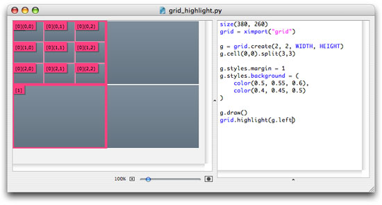
As you can see in the above example, you supply a grid object (or a column or row) to the command and it will indicate the suffix you need to add in your code to reference a particular cell in it.
Adding content
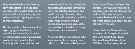
You can fill a grid with text, images or your own drawing command. Simply assign it to the grid.content property. The content automatically gets distributed among the grid’s rows and columns, following a ‘depletion’-approach: cells are filled until there is no content left. The grid.flow list determines which cells get content first (column-first by default).
g = grid.create(1, 3, width=550, height=200)
g.content = open("alice.txt").read() # text from a file
g.draw()
The following types of content can be added to the grid:
- text: a string of text
- image: a single image filename or a list of image filenames
- command: a custom drawing command
- number
After you set the content, the following properties become available:
- grid.content.widows: how many stray lines at the end to move to the next cell (1
by default)
- grid.content.orphans: how many stray lines at the start to move the previous cell
(1 by default)
- grid.content.repeat: when True, cycle through the list of images until all cells are filled.
- grid.content.remainder: the excess content that wasn’t drawn.
Some methods you can use to retrieve content:
grid.content.is_text()
grid.content.is_number()
grid.content.is_image()
grid.content.is_command()
str(grid.content) # retrieve the text content
int(grid.content) # retrieve numeric content
float(grid.content) # retrieve numeric content
list(grid.content) # retrieve the list of images
Again, keep in mind that since each cell in a grid row or column is itself a grid object, you can add content (titles, subtitles, images, ...) to any individual cell.
grid.has_content()
The grid.has_content() returns True if a cell has content, False if it is simply inheriting content from a parent grid.
Flowing content
When a grid is drawn, the content is distributed among its rows and columns. For text content, this means that a piece is cut off from the start of the text so that it matches the size of the current cell (taking into account whitespace, font size and alignment). The remainder of the text is then passed on to the next cell in the flow. Content can flow vertically from top to bottom (column-first), horizontally from left to right (row-first) or in your own custom way.
The grid object has two methods for setting the flow:
grid.flow_vertical(recursive=True)
grid.flow_horizontal(recursive=True)
Additionally, any cells in a grid you add to the grid.flow list will get content first.
Fitting content
In some situations you don’t want content to flow from cell to cell, you want it to match the size of this cell as best as possible. This is especially true for grids containing images and titles. We may want the image in a cell to stretch so it fits the cell comfortably, avoiding gaps. We may want the title to take up all the available space so we can then resize and experiment with the grid without having to worry about fontsize anymore.
To accomplish this we give the cell a style which has its style.fit property set to True:
|
|
g = grid.create(1, 1, 250, 90) g.styles.default.fit = True g.styles.default.align = "center" g.content = "heading" g.draw() |
|
|
g = grid.create(2, 2, 250, 250) g.top.left.split(2, 2) g.top.left.bottom.right.split(2, 2) # fetch images from Morguefile.com web = ximport("web") img = web.morguefile.search("ocean")[:5] img = [x.download() for x in img] g.content = images g.content.repeat = True g.styles.margin = 1 g.styles.fit = True g.styles.align = "center", "bottom" |
Custom content
Instead of adding text or images to the grid, you can also add a custom command as content. This is great if you want to showcase different versions of generative artwork, add embellishments to the layout or document code, for example. The custom command takes the following form:
custom_content(x, y, width, height, style=None)
It receives the grid’s position, size and style as input parameters.
|
|
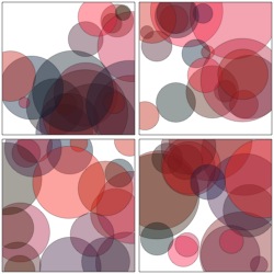
def ovals(x, y, w, h, style=None): for i in range(20): r = random(5, 40) stroke(0.1, 0.4) strokewidth(0.5) fill(random(), 0.1, 0.2, 0.4) oval( x + random(w) - r, y + random(h) - r, r*2, r*2 ) g = grid.create(2, 2, 250, 250) g.styles.margin = 2 g.styles.stroke = color(0.2) g.styles.strokewidth = 0.5 g.content = ovals # custom content! g.draw() |
Working with text
At the heart of the Grid library is the text module. It contains many useful commands for
working with paragraphs of text, even outside the Grid library. These commands are likely to be
in constant development.
text.split(txt, width, height, widows=1, orphans=1, forward=True)
text.divide(txt, width, height, widows=1, orphans=1, forward=True)
The text.split() command returns a (block, remainder) tuple in which block is the first portion of the given txt string that will fit inside a box of the given width and height. The text.divide() command works in the same way, except it returns a list of strings that all fit inside a box of the given size.
The three optional parameters are concerned with widow/orphan control. Widows and orphans are stray lines at the beginning or end of a block of text. We try to avoid these for aesthetic purposes. The widows parameter is the threshold for stray lines at the end to cut off, orphans for stray lines at the start. If forward is True, orphans will never be moved back to the previous block. Instead, more text is cut off from the end of the previous block and moved forward.
Note that widow/orphan control won’t work with lists (i.e. single lines of text separated by a carriage return), so then you’ll need to turn it off.
text.legible_width(txt, chars=70)
text.fit_fontsize(str, width, height)
text.fit_lineheight(str, width, height)
The text.legible_width() command returns a good column width for the given txt set in the current font. Here we follow the rule of thumb in graphic design that 70 characters per line at fontsize 10pt is optimal. When the fontsize becomes smaller, you’ll likely need smaller columns to keep the reader’s attention. Smaller lineheight furthermore decreases the column width.
The text.fit_fontsize() command returns a good fontsize so that the given str fits a box of the given width and height. In the same way, text.fit_lineheight() returns a good line spacing for the text to fit the box vertically.
Placeholder text
If you don’t have any text lying around, you can generate paragraphs of lorem ipsum placeholder text right from the text module. Each command below returns a string of text containing words of different length, yielding a good visual representation of a real text will look like:
text.placeholder(n=10) # a text with n paragraphs
text.placeholder.paragraph(n=10, first=False) # a paragraph with n lines
text.placeholder.sentence(n=6) # a line of n words
print grid.text.placeholder.sentence()
>>> Consectetur dolore sunt nisi, amet deserunt.
The text.placeholder.english() command generates readable text from the Kant Generator:
text.placeholder.english()
Symbols
To create superscript numbers for footnotes, you can use the text.superscript() command. The text module also contains a small set of symbols that may be of use.
print "footnote" + grid.text.superscript(1)
print "we " + grid.text.heart + " you"
>>> we ❤ you
- Arrows: arrow1, arrow2
- Bullets: bullet, heart, check, cross
- Info: telephone, mail
- Emotion: happy, sad
- Currency: euro, pound, yen
- Legal: copyright, trademark, registered
- Danger: warning, toxic, radiation, biohazard, recycling
Working with styles
The Grid library uses the same styling mechanism as the Graph library, so if you are already familiar with that library you will find many similarities here. Essentially, you can customize the look and feel of the grid down to the bottom. The grid.styles dictionary contains different styles, each with a name and some color, font and whitespace properties. Each grid (or cell) has a style property which you can assign the name of a style. You can easily modify existing styles and create new ones.
The styles dictionary has one predefined style:
print grid.styles.keys()
>>> ['default']
You can change the properties of each of the individual style objects:
grid.styles.default.fontsize = 10
Or set a property on all styles:
grid.styles.margin = 5
Here’s an example of how to add your own custom style. Note the optional template parameter: we are creating a new style based on a copy of the default style:
s = grid.styles.create("header", template="default")
s.background = color(0)
Style properties
A style object has the following properties:
- style.background: cell background color.
- style.fill: fill color for cell text.
- style.stroke: stroke color for the cell border.
- style.strokewidth: width of the cell border.
- style.roundness: corner roundness of the cell border (0.0 to 1.0)
- style.font: font used for cell text.
- style.fontsize: fontsize for text.
- style.lineheight: lineheight for paragraph text.
- style.align: horizontal and vertical alignment for text and images.
- style.rotation: flip the content by 90, -90 or 180 degrees (0 by default).
- style.margin: whitespace surrounding the cell.
- style.padding: whitespace inside the cell.
- style.clipped: when True (default), content that overflows the cell boundaries is clipped.
- style.fit: when True, scale the content to fit the cell.
- style.delegate: when True (default), distribute style properties to child
cells.
Background
The background of a cell can be a fill color, an image, or a gradient. You can assign it a single color, a tuple of two colors for a gradient or an image filename. If you want to draw a gradient you’ll need to have the Colors library installed.
For more complex gradients, use the following method:
style.background.gradientfill(self, clr1, clr2, type="radial",
                              dx=0, dy=0, spread=1.0, angle=0, alpha=1.0)
The style.background also has some properties to define how background images are attached:
- style.background.align: see below.
- style.background.scale: scale factor for the background image (1.0 by
default).
- style.background.x: horizontal offset.
- style.background.y: vertical offset.
- style.background.opacity: alpha transparency (1.0 by default).
Alignment
The style.align property determines how content in a cell is arranged.
- For text, applicable values are LEFT, CENTER, RIGHT and JUSTIFY.
- For images, you can supply either a single value or a (horizontal, vertical) tuple.
Additional values here are ‘top’ and ‘bottom’.
Whitespace
The style has margin, padding and stroke properties to define whitespace and cell border. Each of these can be assigned a single number, or a (left, top, right, bottom)-tuple of values. You can also set the individual spacing with properties:
- style.margin.left: left margin width (or padding/stroke).
- style.margin.top: top margin height (or padding/stroke).
- style.margin.right: right margin width (or padding/stroke).
- style.margin.bottom: bottom margin height (or padding/stroke).
|
|
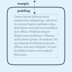
Cell box model This illustration shows how a cell’s whitespace is organized. Assume that the blue box is a cell. It’s total size is defined by cell.width and cell.height. Margin space goes around the cell border. The inner rectangle defines the space available to draw text and images (cell.content_width and cell.content_height). |
Style delegation
When you set the style for a grid, all of the cells in the grid will inherit the same style. We say that this grid is an invisible container, and instead of appyling styling to itself, it delegates the styling to all of its children.
This works intuitively in most cases. Take a look at the example below. I’ve created a default style, and a style for the header. All the cells in the header assume the same ‘header’ style.

g = grid.create(3, 1, WIDTH, HEIGHT)

g.top.name = "header"
g.header.split(1, 5)
g.header.height = 40
g.header.style = "header"

g.styles.default.margin = 1
g.styles.default.background = (
    color(0.5, 0.55, 0.6),
    color(0.4, 0.45, 0.5)
)

s = g.styles.create("header", template="default")
g.styles.header.background = (
    color(0.45, 0.5, 0.6),
    color(0.35, 0.4, 0.5)
)

g.draw()
In some case however, style delegation works counter-intuitively. Suppose you wanted to define one background image for the entire header. You would set the header style’s background property to an image, which would then be delegated to all the cells in the header. Result: each cell gets its own copy of the image.
To counter this, set style.delegate to False. The image (or color or border) is then applied only to the container. You’ll now have to create a second style for all the individual cells in the container though.
grid.has_style()
The grid.has_style() returns True if a cell has a style set, False if it is simply inheriting a style from a parent grid.
Working with proportions
Proportion is the relationship in terms of size between rows and columns. The library offers a set of automated proportions to quickly create nice-looking layouts:
- even: (default) all columns are evenly wide, all rows evenly high.
- fib: rows and columns are proportioned according to the golden ratio
(1.618).
- random: rows and columns are randomly proportioned (mainly useful for experimenting).
- contrast: a few wide columns, many narrow columns (mainly useful for experimenting).
A golden ratio means that if the width of one column would be 1, the width of the next column would approximate 1.618. The distribution between the two columns is roughly 3/8 and 5/8. Throughout history, artists and architects have believed this proportion to be visually pleasing.
The golden ratio can also be found in various natural arrangements (such as shells and
branches). A mathematical solution to generate a sequence of numbers with a golden proportion
is the Fibonacci algorithm: fib(n) = fib(n-1) + fib(n-2) with
fib(0)=0 and fib(1)=1
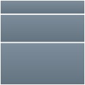
|
The easiest way set a grid proportion:
g = grid.create(3, 1, width=125, height=125) g.proportion = "fib" |
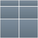 |
You can also supply a (horizontal, vertical) tuple. In this example we
use a golden proportion for the rows, and an even proportion for the columns:
g = grid.create(3, 2, width=125, height=125) g.proportion = "even, "fib" |
Custom proportions
When you need something more elaborate (but not that elaborate that you’re going to define the width and height for each row and column yourself) you can work with the custom proportion() command:
proportion(distribution="even",
           sorted=False, reversed=False, shuffled=False, mirrored=False,
           repetition=1, n=None)
The command will return something you can assign to the grid.proportion property (or two of them in a tuple). When sorted is True, the sequence will be ordered from small to large (vice versa if reversed is True). When mirrored is True, small values in the sequence will be grouped in the middle surrounded by the larger ones. The repetition parameter defines how many times to repeat the pattern.
For example:
g = grid.create(1, 7, width=550, height=150)
g.proportion = grid.proportion("fib", mirrored=True, repetition=2)
g.styles.default.margin = 1
g.styles.default.background.gradientfill(
    color(0.5, 0.55, 0.6),
    color(0.4, 0.45, 0.5),
    type="linear",
    spread=int(g.height)
)
g.draw()

Resizing cells
You can resize cells, rows and columns either by an absolute value or by a
relative value between 0.0 and 1.0. For example: the total relative width of all the
columns in a grid is 1.0 (or 100%). If there are four even columns in the grid each column’s
relative width is 0.25 (25%).
grid.size(width, height, fixed=False, relative=False)
The following properties can also be used to resize a cell, column or row:
- grid.width: a cell’s width in pixels.
- grid.height: a cell’s height in pixels.
- grid.relative_width: a cell’s width as a number between 0.0 and 1.0, relative to other cells.
- grid.relative_height: a cell’s height as a number between 0.0 and 1.0, in relative to other cells.
- grid.fixed: True when this cell does not automatically rescale to make room for other cells.
For example:
g = grid.create(2, 2, WIDTH, HEIGHT)
g.top.relative_height += 0.25
When you resize a cell in a grid, the other cells in the same row or column will contract or
expand evenly to make room. The grid’s proportion will be respected as best as possible in the
course.
View demo
However, if a cell has its fixed property set to True, it will always retain the size you give it.
Spreadsheet statistics
Each grid, row and column has a number of properties for doing simple statistics on
numerical cells:
grid.count # the number of cells
grid.used # the number of cells that have content
grid.empty # the number of empty cells
grid.numeric # the number of numeric cells in the grid
grid.numbers # list of numerical values
grid.sum # sum of all numerical values
grid.avg # average
grid.min # lowest number in the set
grid.max # highest number in the set
grid.variance # how spread out is the distribution?
grid.stdev # standard deviation
This allows you to quickly calculate the content of cells based on the numbers in other cells. The advantage is that you can create a spreadsheet template once, and then reuse it with other data or other visual cells.

downloads = {
    "2007": [622, 3384, 3856, 2024, 2027, 1593,
             1352, 1326, 1309, 4822, 2988, 1536],
    "2008": [961, 5207, 10980, 7221, 7797, 1975]
}

g = grid.create(len(downloads)+1, 12+2, width=550, height=60)
g.styles.font = "Helvetica"
g.styles.background = color(0.5, 0.65, 0.8, 0.25)
g.styles.fill = color(0.4)
g.styles.margin = 1
g.styles.padding = (4, 2, 0, 0)

# Table header.
months = ["jan", "feb", "mar", "apr", "may", "jun",
          "jul", "aug", "sep", "oct", "nov", "dec"]
s = g.styles.create("header")
s.font = "Georgia-Bold"
g.top.style = s.name
g.top[0].content = "downloads"
for i in range(12):
    g.top[i+1].content = months[i]

# Each year is a row.
# The leftmost column displays the current year.
# The rightmost column displays the total per year.
for i, year in enumerate(downloads):
    row = g.rows[i+1]
    row.left.content = year
    for j, monthly in enumerate(downloads[year]):
        row[j+1].content = monthly
    row.right.content = row[1:-1].sum

g.left.relative_width = 0.15
g.right.relative_width = 0.1
g.draw()

g.column(1).name = "jan"
print g.jan.avg
Multiple pages
The library has two commands to store a grid in memory and reload it:
grid.save(grid_object)
g = grid.load()
This is especially useful because the grid.content.remainder property will contain any content that hasn’t been drawn - and therefore should be drawn on the next page.
In the simple example below we create a grid with some content for the first page. The next pages we export (File > Export as Image > Number of Pages) will start from the remainder of text for which no room was left on the previous page.
grid =  ximport("grid")
size(400, 400)

if PAGENUM == 1:
    g = grid.create(1, 2, WIDTH-40, HEIGHT-40)
    g.styles.background = color(0.5, 0.65, 0.8, 0.25)
    g.styles.fill = color(0.3)
    g.styles.padding = 10
    g.styles.margin = 2
    g.content = grid.text.placeholder.english()
else:
    g = grid.load()
    g.split(1, random(1,3))

g.draw(20, 20)
grid.save(g)


